


This is the last page of my synthesis portfolio and contains all of my work and contributions to my final major project. On this page you will find examples of my work as a Production Designer & Costume Designer on the short film 'Beware Out There!'. I will present all of my work during the production and any behind the scenes insights I have, talking you through the journey of production of this original, collaborative short film. In addition, I will explain and exhibit any other work that I have partaken in during my final semester at MFS.


Written & Directed by Jacob Gainsborough
My Roles: Production Designer & Costume Designer
Below you can find all of the work I have done during production of 'Beware Out There!'. This includes my prop making, set design and building, costume design and bringing them to life, behind the scenes shots of how I worked on set, budgets, drawings, designs etc.
Please take a look at my work below.

Click & Scroll To View

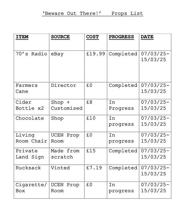
Final Props List
This props list I created was used to keep necessary crew updated on props progress
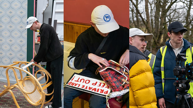

This section below contains my work as Production Designer on 'Beware Out There!', designing props and then creating them, making them ready for screen.
As Production Designer on this film I had a very 'hands on' role in the art department.
Read below for my work on props.
Making 'Private Land' Sign
16th - 22nd January 2025
Details About The Prop:
This prop will be used as the farmers private land sign, which will be hung from his gate leading to his land. See Script Breakdown for more information.
Gathering Equipment
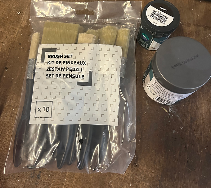
Here are the range of paint brushes and paints I purchased to create our 'Private Land' sign.

Gathering Materials
I sourced this piece of scrap wood that I thought would be perfect for making our sign.

Gathering Materials
This is the paint I used as the white base layer of our 'Private Land' sign.
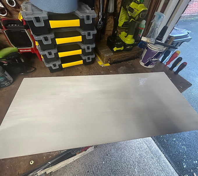
First Coat of Paint
Here is the sign after it's first coat of white paint. I then applied one more coat before adding the details to the sign.

Drawing Outline of Sign
In this image you can see me drawing the outline of the sign, the borders to where I would cut the wood down to create the perfect sign I was happy with.
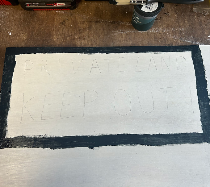
Painting Border & Drawing Text
This image shows where I painted the outline of the sign. I then sketched out the text to give me an idea of where to paint.

Preparing to add details
I was now at the stage where I was ready to add details to my sign such as lettering. After choosing from a variety of different colours of red, this is what I opted for as it was closest to my original design.
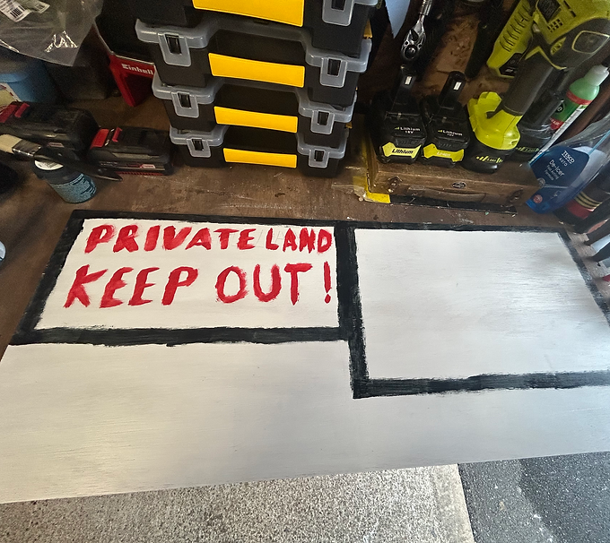
Painting Lettering
In this image you can see how the sign looks after I have painted over the sketched out text, this was the first coat of paint for the letters, I would then add a second.

Cutting out the sign
Here I am sawing the sign down to the shape that I want it, using the black painted border as a guide to wear to saw.
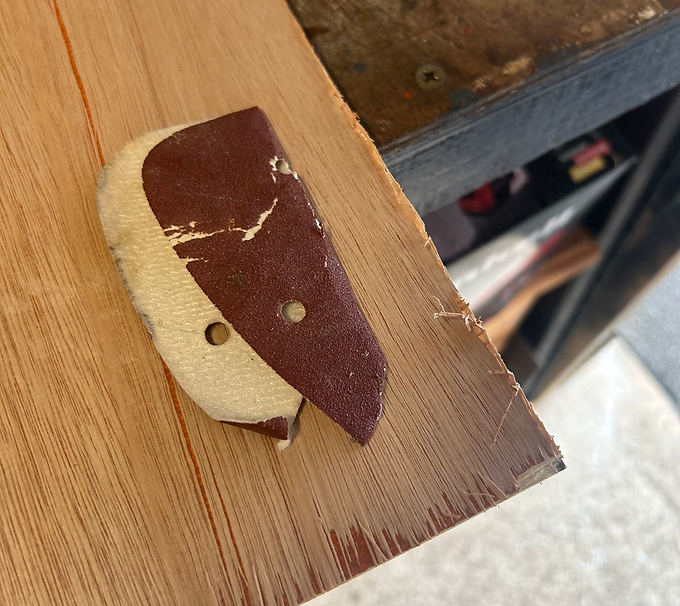
Sanding down rough edges
I am now preparing to saw down any rough edges to the sign and making the corners more rounded rather than pointed. I chose to do this as it will look more aesthetically pleasing on camera. It is also safer to handle as it reduces the risk of sharp wood fragments.

Rounded Corners After Sanding
This image shows what the sign looks like after I sanded down the rough edges and corners. I am really happy with how this turned out by just using some sandpaper and rubbing down to the desired look.
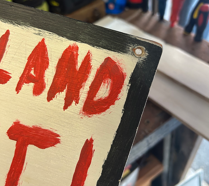
Drilling Holes for Hanging the Sign
My last work on the sign was to drill holes into the corners of the sign so that it could be tied to the gate in the shot that it's needed. I was then planning to use bailing twine (Authentic to a farmer) to tie our sign to the gate. Once the holes had been drilled I then sanded over the rough edges that had been created by the drilling and then painted over where I had sanded to finalise the sign.

Original Concept Drawing For Sign
This is the original design of the sign that I drew out when presenting my ideas to the Director in my art proposal. After confirming with the Director that he was happy with my design, I then followed it has closely as possible when actually making the sign. As you can see to the adjacent image, the final product came out exactly how I wanted it to. The only thing I changed was making the black border slightly wider than planned as I think it is much more eye catching and bold.

Final Product - 'Private Land' Sign
Here is the finalised product. I am very pleased with how this turned out as it is very close to the original design that myself and the Director agreed upon. It was now time to see how the sign would look on screen in the scenes it's needed for.
Videos of Making the Sign
Painting
Sanding
Drilling
Making Cider Bottle Props
5th - 26th February 2025
Details About The Prop:
This prop will be carried by the character James and then also by the Farmer. It will then be buried with the body of James. It needs to be period accurate to the 1970's. See Script Breakdown for more information.

Choosing Bottles to Customise as Prop
These are the two bottles I sourced to turn into our own brand of cider bottle prop. I decided to create two as then there would be a backup option if anything went wrong with the other. This would also help with continuity.

Soaking Bottles to Remove Labels
This image shows the two bottles being soaked in hot water to remove the labels easier. By soaking them in boiling water, it helps to soften the adhesive making it easier to peel off the label and any residue left over.
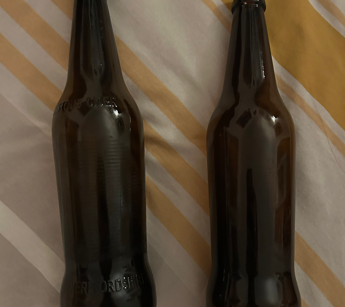
Removed Labels & Cleaned Bottles
Here is what the bottles looked like after I had removed all residue from the labels. After I had soaked them in boiling water, I used a stainless steel scourer brush to take off any residue without damaging the bottle.

Printed Out Design for Labels
After spending some time working on the design and undergoing research about cider bottles in the 70's, this is what I decided upon. I printed the designs out professionally after working out the measurements so they would fit onto the bottles.
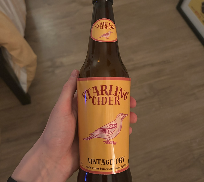
Applying Labels to Cider Bottle - Front
After applying the labels I had created to my cider bottle, I wasn't too happy with how they turned out. Something wasn't quite right and I wanted to make some adjustments to the design slightly so they would fit the bottles better. I was happy with the colours I had used and fonts but overall I wasn't satisfied so I went back to the drawing board and redesigned.

Applying Labels to Cider Bottle - Back
After applying the labels I had created to my cider bottle, I wasn't too happy with how they turned out. Something wasn't quite right and I wanted to make some adjustments to the design slightly so they would fit the bottles better. I was happy with the colours I had used and fonts but overall I wasn't satisfied so I went back to the drawing board and redesigned.
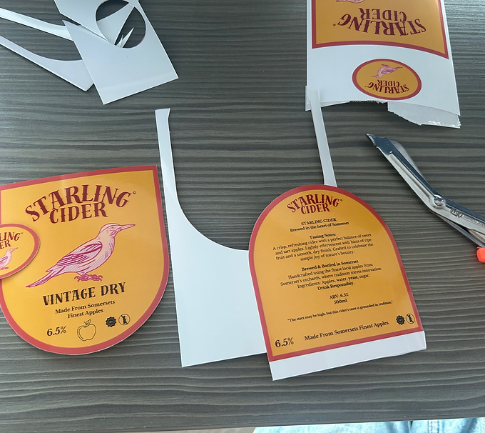
Cutting Out Redesigned Labels
Once I had changed the design slightly and opted for a curved edge rather than flat, I then applied double sided tape to the back of the labels and cut around the design very carefully.

Applying Labels to Cider Bottle - Front
This is what the final versions of the cider bottle props look like from the front. I am very happy with how they turned out. I kept to the brief of being authentic to the 1970's with this colour scheme and text. Deciding to change the shape of the labels really worked well and fit on the bottles nicely.

Applying Labels to Cider Bottle - Back
This is what the final versions of the cider bottle props look like from the back. I am very happy with how they turned out. Deciding to change the shape of the labels really worked well and fit on the bottles nicely. On the back of the design you can see the details I have added such as ingredients, location of the produce, alcohol percentage and a slogan. Although these details may not be visible on camera I still wanted to include them as it is a nice piece of detail and really makes the branding look authentic. I chose these two colours as the main branding because they suit the 70's aesthetic.

Designing the Brand and Labelling
When coming up with ideas for our cider bottle branding, I knew that it had to be our own brand to avoid any copyright issues and to add some originality to our film. However, I wanted to take inspiration from other popular cider brands in the 70's. The one brand that I took inspiration from the most was 'WOODPECKER' cider (See Art Treatment on Pre-Production page for more details). I decided to keep the bird theme but by using a different bird that hasn't been used for an alcoholic drink before.
Making Chocolate Bar Prop
2nd - 9th March 2025
Details About The Prop:
This prop will be carried by the character James and then also thrown at the Farmer. It will then be buried with the body of James. It needs to be period accurate to the 1970's. See Script Breakdown for more information.
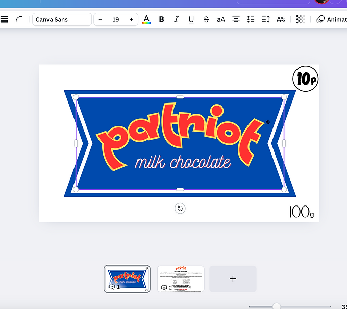
Designing Chocolate Bar - Front
The design of the chocolate bar by myself was heavily influenced by a previous prop used by the director in one of his previous films. He gave me these specific notes when I asked about what we wanted for this design 'It should be called PATRIOT based off of one of my previous films, and the colours should be predominantly white with blue and red accents similar to the flag of the USA'. After taking these notes on board, this is what I created, taking some inspiration from the 'curlywurly' design but also making sure it was original and authentic to the 1970's look.

Designing Chocolate Bar - Back
Here is the design of the back of the chocolate bar packaging. On the back of the design you can see the details I have added such as ingredients, location of the produce and a slogan. Although these details may not be visible on camera I still wanted to include them as it is a nice piece of detail and really makes the branding look authentic.

Final Product - Front
In this image you can see the final product after I had made it. To make this prop I used a real chocolate bar as in one scene the character James has to break off a piece and give to Linda. This wouldn't have looked as authentic if I used something else as an alternative. For continuity purposes I had to have several chocolate bars to hand as pieces would be taken apart and then thrown in the scene so I would then have to replace them depending on the amount of takes. I also had multiple packaging pieces on hand with me to replace if needed.

Final Product - Back
I added a hidden 'easter egg' by adding the title of the film on the back 'BEWARE OUT THERE!'. I like to add little hidden things in my props/sets and I thought this would be a good opportunity to do so. I wrapped the chocolate bar in tin foil and then used the packaging to wrap around the bar and tin foil. I chose to wrap the bar in tin foil as I think it gives the chocolate bar a classic look and keeps with the authentic 70's look as my research suggests.
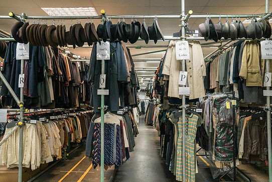

The section below contains my work on costume in our film 'Beware Out There!'. I sourced all of the costumes myself and made adjustments/additions to the costumes that needed it. I thoroughly enjoyed working on costumes for this film, from designing them, sourcing them and then making them come to life on screen.
Read below for my work on costume.
The Process...
4th March - 10th March 2025
The process of bringing the costumes to life on screen involved many steps before actually being able to present the actors with their costumes and for them to be screen ready. The first step to this process was to discuss with the Director his vision of the characters he created and help him bring them to life. I made as many notes as possible from the Director's insights on the characters so I could start to form a picture of these characters and more importantly what they would be wearing. After the Director and I had agreed on certain elements he wanted to highlight about the characters costume and now that I had started to form visuals of these costumes in my head, it was time to start creating concept art/designs. After presenting my designs back with the Director and tweaking things to his desire, confirmation and approval then allowed me to start sourcing and making these costumes ready to be used on screen.
Below you will find my designs and the final product of the costumes I have created, character by character.
James' Design
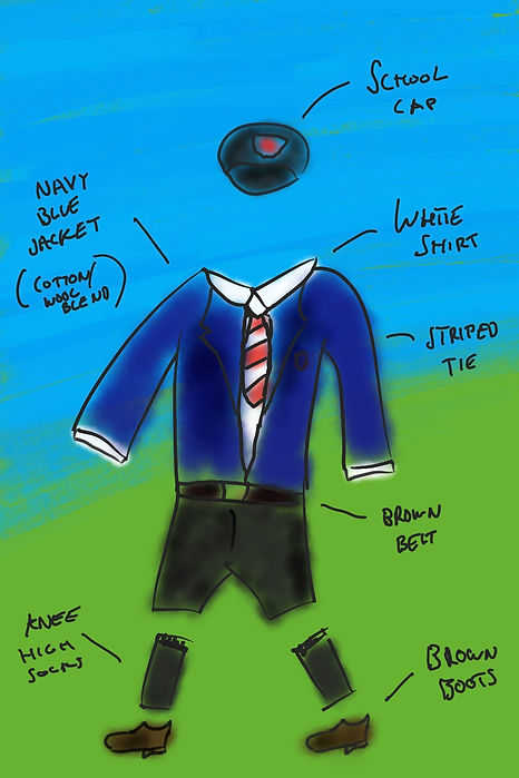
James' Costume
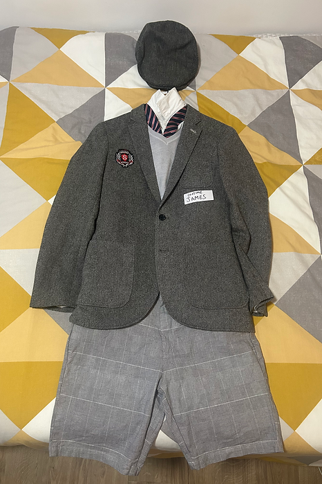
Details about James' Costume
I made the decision to change the school uniform from being navy blue to a more monochrome, grey colour scheme. This was due to more research into 70's school uniform saw that predominantly grey and dull colours were used for uniform back then. Another reason for this change was to enhance and emphasise the colour red more, as seen in the badge and tie. This costume was also accompanied by black pointed shoes and grey knee-high socks similar to the original design.
Linda's Design

Linda's Costume

Details about Linda's Costume
I made the decision to change Linda's school uniform from having whites and light blues to a more monochrome, grey colour scheme. This was due to more research into 70's school uniform saw that predominantly grey and dull colours were used for uniform back then. Another reason for this change was to enhance and emphasise the colour red more, as seen in the badge and tie. This costume was also accompanied by black, strapped shoes and grey knee-high socks similar to the original design.
Farmer's Design
Farmer's Costume
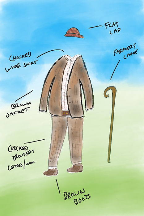
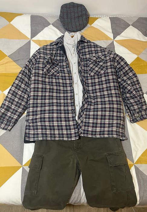
Details about Farmer's Costume
The final costume in comparison to the original design hasn't changed too much. The only thing that I did change slightly was the more casual look as my original concept drawing showed the farmer to be wearing slightly smarter clothes. The reason for this change was because I believe the casual look suits the narrative slightly better, as the farmer is seen patrolling his land and gets caught off guard when he notices trespassers. I kept with using checkered shirts as this was a popular choice in the 1970's as per my research. This costume was also complimented with brown boots, similar to the original concept art.
James' Mum Design
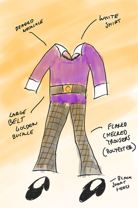
James' Mum Costume
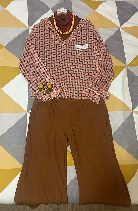
Details about James' Mum Costume
I decided to make a few slight changes to this costume. This was primarily due to wanting more classic 70's browns in our film. I still used the beaded style necklace as this was a popular choice of jewellery for women in this decade. However the overall style of this outfit hasn't changed much from my original design. I decided on a geometrical patterned top with flared wrists and then complimented with a beaded bracelet.
Making & Sourcing Costume
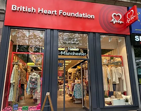
The main part of getting costume ready for screen was to source the costumes to the best of my ability in accordance to my designs and the directors vision for the characters. I sourced the majority of costume pieces from charity shops. This was partly because it was better for the budget, but also because I want to be a sustainable costume designer/production designer in my work. By purchasing clothes from a charity shop I am not only helping out the charity itself but also giving pre-owned clothes a new life. As clothes in film are only worn a very little amount of times, it would not be sustainable to buy the amount of clothes I needed for our four characters to just use for a week of filming and then disregard afterwards. In addition, to help with this I plan to donate clothes back to charity shops after we have used them.
Where I purchased Costume Items From



Making the School Uniform
Turning Regular Thrifted Clothes into School Uniform
When I first read the script it was made clear to me that the biggest challenge would be putting together two matching school uniform costumes that looked authentic to the 1970's. This would've been a simpler challenge if it was children I was buying for as I could just buy pre-worn school uniform however as I was buying for two adult actors this made this more challenging. To overcome this challenge I decided to make my own school uniform from using thrifted clothes. In our PPM's we discussed possibly collaborating with the costume department at the university to help make the school uniform but after delays in receiving measurements we could not agree on a plan that would meet our deadline before shooting. Instead I came up with a plan to create the costumes myself. Below are pictures of the process.
First I purchased the costumes after receiving the measurements of our actors playing 'James' & 'Linda'.
Next, I purchased two iron on school badges, I knew that I wanted them to be red (as previous stated our Director made it clear to emphasise the colour red) and generic so that I didn't come across any issues of using a genuine school badge.
After receiving the badges it was time to apply them to the blazers.
These badges were iron on patches but with the embroidered quality of a standard school badge.
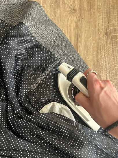
The next step was to place the position of the badge in it's desired spot. I then used the iron on a high heat to press down on the badge and brushing over it in a circular repeatedly.
Leaving the iron on a high heat on the material for too long may cause it damage so I would take it off and then re-apply a few times before doing the same process on opposite side of the blazer.
I did this process on both blazers and made sure to measure the distance of the badge in comparison to the blazer so both were evenly placed.
Although I ensured the badges were secure to the jackets by repeating this process a few times, I bought a pocket sized sewing kit with me on set and location incase the badges became unstuck.
James' Costume

Linda's Costume

Applying Badge to James' Costume
Fitting Actors Into Costume
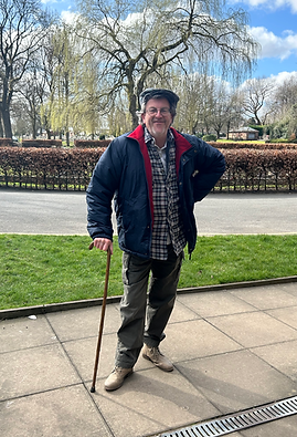
Here we have the moments I handed our brilliant actors their costume for the first time. This was my first time seeing them in the costumes I had designed and put together.
(Note: The image showing the character of James' Mum is from the rehearsals as we did not get chance to give the costume to her prior to the shoot day, and Gregg who plays the Farmer is wearing his own coat in the image, this would not be used on screen). This was an important part of the process, to make sure all of our actors were comfortable in what they would be wearing and this also gave me a chance to make any amendments needed. All was well and we were now ready for shooting.


James
Linda
Farmer
Mum
Costume Inspiration & Research
In this section I will be talking about the inspiration behind the costumes I created and the research that went into getting our costumes as accurate as possible to the 1970's. This research was vital as it would be the difference between having period accurate costumes, it would also allow our audience to quickly realise that this is a period film not set in the modern day. I felt I had a large responsibility as the costume designer to ensure these costumes made the right impact on screen.
Research Timeline
15/11/2024
1970's PIF Screening
On this day, Jacob our Director, held a 'Public Information Film' Screening for the HOD's on this production. In this screening I was able to make a variety of notes about the costumes worn in these films that inspired the original script.
December 2024
Watching ' Back In Time For
Dinner & the Weekend'
'Back in Time for Dinner' & 'Back in Time for the Weekend' are television series produced by the BBC where a family in the UK has their home and all possessions replaced with those from a certain decade in history. I rewatched both episodes where they are transported back to the 1970's. This helped massively with my inspiration for costume for the school uniform & Mum's clothes.
January 2025
Family Photos
& Archived Footage
My Parents both grew up in the 70's/went to school in this decade. They were kind enough to show me through photo albums and give me advice on what was in fashion and what themselves and my grandparents would typically have worn in this period. I also chose to watch as much archived footage as possible from the 70's in the UK. This was viewed through YouTube and Box of Broadcasts.
From my research I was then able to gain great inspiration and then started drawing my concept ideas for our four costumes.
See my Original Designs Here



11/03/25 - 13/03/25
For three days we were out on location. Two days at Prestwich Forest Park & one at Pots and Pans near Greenfield. In this section I will explain and analyse my experience as a Production Designer whilst filming out on location.
Day One of Shooting on Location
11/03/25 - Prestwich Forest Park
Transporting Equipment to Location
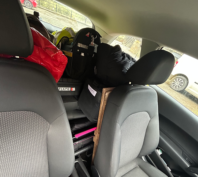
Surprisingly I was the only person in our crew that had a car and driving license. As we were not using the uni van, we needed a way to transport kit to the locations. I offered to help take everything as otherwise we would not have a way of transporting kit. This required the producer and I to be at university before anyone else in our crew, to load up the car and set off to the location.
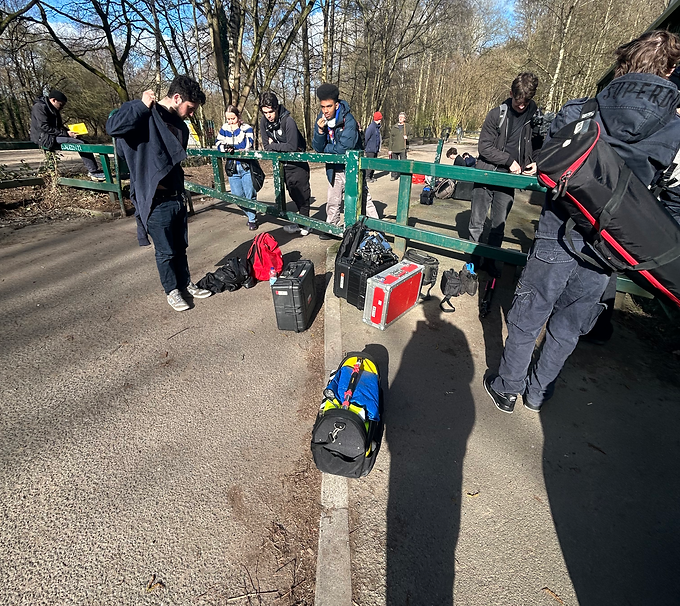
Attenting Safety Briefing
Once all crew had arrived onto set it was time to engage in a safety briefing held by the 1st AD. In this time I ensured that my art department crew (runner and art director) were present and clear on any safety procedures the art department would need to carry out.

Transporting Actors
After the safety briefing the actors then needed to change into costume. I took the talent to and from their changing rooms, ensured everything was in order with costume, and then travelled them back to set to meet up with the rest of the crew.

Arriving at Base Camp
The talent and I then arrived at base camp, where I met up with my art crew and gave a briefing to them about the overall plan of action for the day. Here I designated sub-roles for the day such as 'Prop Master'. As our shoot was very prop heavy, I needed someone to safeguard the props and then be able to bring them over to the camera setups where action was being filmed when needed. This worked really well as it meant I didn't always have to carry a large bag of props with me. I also had piece of mind that they were in safe hands and could be made available to me with just a simple instruction over a walkie-talkie.

Briefing Art Crew
In this image I am sorting props out by telling our runner which props would be needed for the next couple of scenes in this location. This way it was a speedy process when the props were needed.

Labelled Props Bag
I decided to label my bag of props so that when out on location, everyone knew what this bag was, whether that was art department or any other crew.

Going for a Take
In this image you can see the crew going for a take in our first scene of the day. After camera had finished setting up I checked the monitor to see if I was happy with how costume looked. After checking, I took a step back from the camera to not get in anyones way.

Changing Location for New Scene
This image shows our crew setting up a new base camp as we had moved locations slightly for the next scene. I had to ensure all equipment and props were transported safely to this location.

Props on Standby
For this next scene, two crucial props were needed, one of the cider bottles and the farmers cane. It was my job to have the props handy to give to the talent when they needed them. I was doing this job as our art runner had to be on location management duty, informing the crew if any of the public were about to walk past whilst shooting.

Going for a Take
In this image you can see the crew going for a take in our last scene of the day. After camera had finished setting up I checked the monitor to see if I was happy with how costume looked. After checking, I took a step back from the camera to not get in anyones way.

Transporting Kit Back to Car
Now that was our first day of shooting on location for Beware Out There! It was my job then to ensure all art department equipment and props made it back safely ready to go again tomorrow!
Day Two of Shooting on Location
12/03/25 - Prestwich Forest Park

Finding the Perfect Prop
Our first scene of the day involved the 'large stick' prop that impales the protagonist in this film. The Art Director and I had to find the perfect stick for this scene whilst the camera and sound teams were setting up.

Disguising & Placing the Prop
In this image, I am placing the prop we found. We used a sandbag to stand the stick in an upright position so it looked like it could impale someone as this was the Directors idea. I then had to disguise the sandbag and make the stick look as natural as possible as if it was actually there in the first place. I used dried grass to cover the sandbag and blend the stick in with the environment around it.
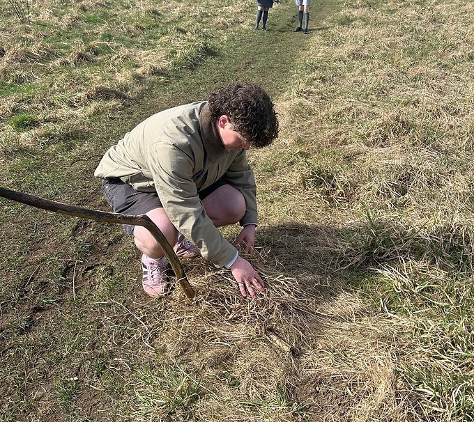
Art Director Making Final Additions
Here you can see Connor, my art director, making some final additions to the prop as we were about to go for a take. As you can see here, the sandbag was now completely invisible and the stick looked as natural as possible.
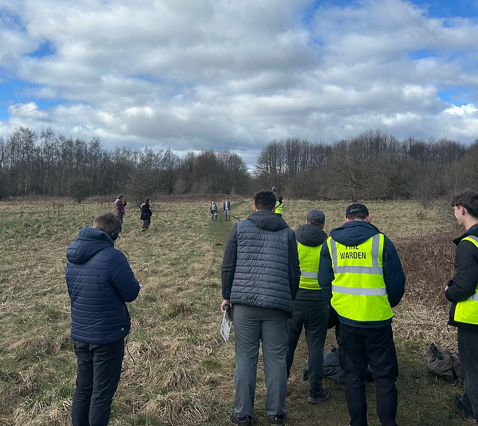
Going for a Take
In this image you can see the crew going for a take in our first scene of the day. After camera had finished setting up I checked the monitor to see if I was happy with how costume looked and the prop we had set up earlier. After checking, I took a step back from the camera to not get in anyones way.

Reviewing Prop on Monitor
This image shows what I could see on the monitor when checking to see if the prop that the Art Director and I set up was how we wanted it. After confirming with the Director and DOP it was time to go for a take.
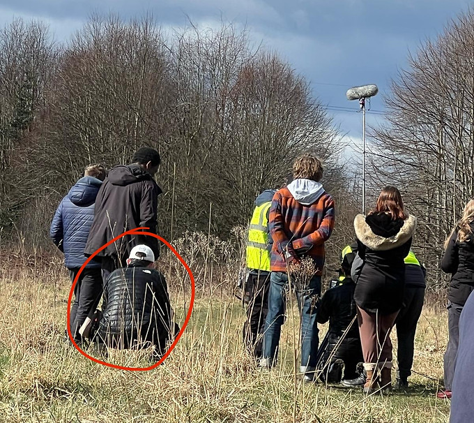
Watching a Take
Here you can see me knelt down beside the camera crew watching the action unfold from the same height as the camera. As I didn't want to get in the way of the camera team I kept my distance but still wanted to watch on incase I could notice any problems with costume or props and then promptly make any amendments needed.

Sheltering from Rain and Protecting Equipment
Unfortunately on this day of shooting we came across some bad weather whilst filming. We came together as a team and promptly protected all the equipment under the shelter as well as the cast. After the rain had passed we all efficiently set back up ready to carry on and make up time.

Adjusting Props & Costume
After the rain had passed crew efficiently set back up and got ready to go for another take promptly. In this time it was my job to check over costume to ensure it hadn't been effected by the rain, and also make some small adjustments to the prop we set up as the grass around it had gotten wet. We made up time throughout the rest of the shoot and it was a successful day on all accounts.
Day Three of Shooting on Location
13/03/25 - Pots & Pans (Greenfield)
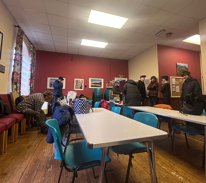
Arriving at Base Camp
On the morning of our final day of shooting on location, all crew arrived at our base camp and got prepared to travel to the location for filming.

Prepping Props
In this image I am pictured getting props ready to be taken to the location for filming. The props pictured are James' school bag, the private land sign and wild flowers.

Fixing Costume
On the morning of the shoot I checked over our actors costumes as they had been taken home with them the night before. I noticed that the costume of James needed fixing as the school badge had started to become unstuck from the blazer. I quickly thought of a solution for this, found an iron and sorted the problem right away. We were now all ready to travel to the location and start shooting.
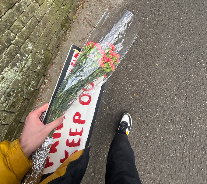
Travelling Props to Location
The first location of the day for shooting was only a short walk away from our base camp. I ensured I had all props that were required in the first scene we were shooting of the day.
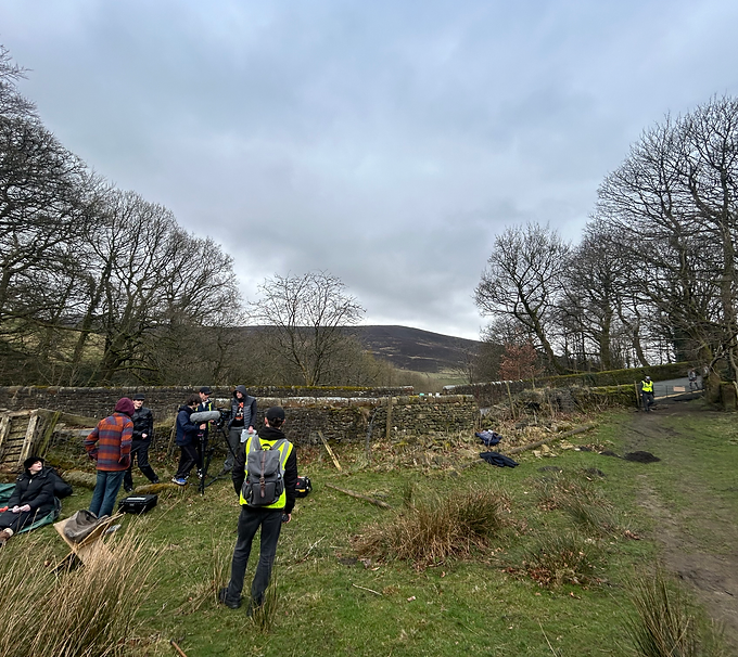
Arriving at First Location
This is the moment captured where we arrived at our first location of the day. As the crew got set up and actors were taken for blocking, it was my chance to set up props around the area that would be in shot.

Fixing Prop to Gate
In this image you can see me fixing the Private Land sign to the gate. The director is giving passing notes on the general area to put the prop. I attached the sign with bail twine as previously mentioned, threading it through the holes I drilled and then tying the string together at the back of the sign. I then cut the loose ends to make it look more appealing on screen.
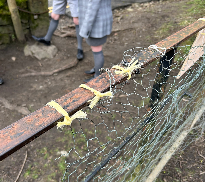
Safety Precautions
Whilst crew were still setting up, the 1st AD came over and spoke to me about helping to sort a possible health and safety hazard. The chicken wire attached to the gate had very sharp edges that were exposed. Our actors were having to open and close the gate during the takes and we wanted to avoid the risk of anyone cutting themselves on these sharp edges. To overcome this issue I wrapped the exposed chicken wire around the top of the gate as shown and then tied more twine to fixate it to the gate. I decided to use twin instead of tape or another solution as this kept the gate looking authentic. This solution was very affective and helped to avoid any harm to our talent and crew.

Private Land Sign Attached to Gate
Here is what the prop looked like once it was attached to the gate ready for filming.
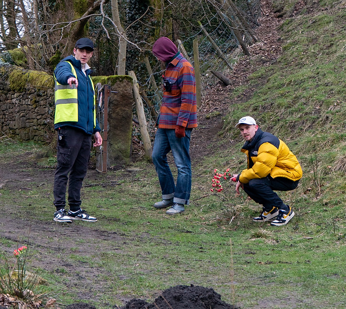
Placing Prop Flowers
In this image I am placing the flowers so they look as if they are wild flowers, growing out of the ground. To achieve this look I made small holes in the ground and placed the flowers in the ground so they would stand up. As you can see I am discussing with the DOP about where best to place the flowers so they are visible on camera as best as possible as these were a key prop to the narrative.

In Conversation with Director & DOP
Here I am pictured discussing with the DOP and Director about the prop flowers that I just placed and deciding whether more needed to be in frame or not.
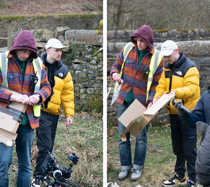
Improvising Making a Camera Lens Cover
For the last shot of the day the Farmer shovels dirt onto the camera lens acting as if he is covering the body of James. The DOP had purchased a clear perspex sheet that would cover the lens and protect the camera. However, when we opened it up before shooting we realised that the perspex wasn't clear, therefore the shot would not be clear. We had to quickly improvise as we were running on a tight schedule.

Making the Camera Lens Cover
I was put in charge of making the temporary lens cover as I had equipment on me to do so with the help of the camera team. I cut a square hole in the middle of the box that the perspex came in. The box would then be held over the camera lens to avoid any dirt being thrown onto it.
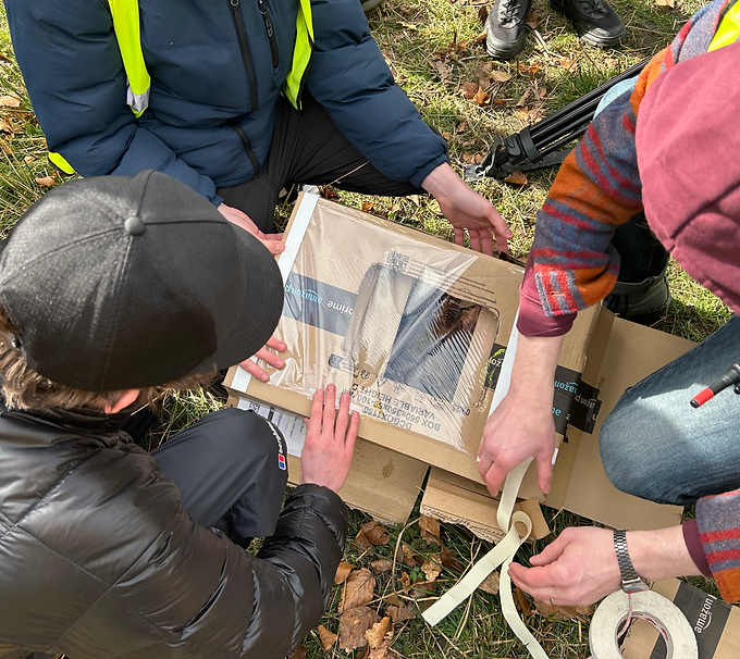
Making the Camera Lens Cover
Here we are putting the clear plastic packaging wrap over the box and taping it secure. This is where the lens will be able to see through and dirt can be thrown onto to cover the shot.

Making the Camera Lens Cover
Here I am working together with the camera crew, taping the clear plastic packaging wrap over the box, collaborating trying to get our new makeshift device ready for the last shot of the day.

Collecting Dirt to Shovel Onto Camera
In this image you can see me with the Farmers prop shovel. As head of the art department it was my job to collect a pile of dirt that would be shovelled by the Farmer over the makeshift lens cover.

Helping Camera Crew
This image shows the setup of our last shot of the day. I am led down holding our new device that we had just made in front of the camera. The Farmer would then shovel from the dirt pile I had collected and throw it onto the box filling the entire shot with dirt. This shot came out really well and it is a great to see our collaboration, teamwork and improvisation has a huge impact on this final shot.

Collecting Dirt to Shovel Onto Camera
In this image you can see me with the Farmers prop shovel. As head of the art department it was my job to collect a pile of dirt that would be shovelled by the Farmer over the makeshift lens cover.

Wrapping & Packing Equipment Away
Our on location shooting days were up for this shoot, we had captured everything we needed and it was now time to de-rig and pack equipment away.
A Wrap On Location Shooting!
And that was a wrap of the three days shooting on location. A very successful and productive three days. It was now time to move back to the studio for our final day of shooting.
Read below for my work on our set build and final day of production!
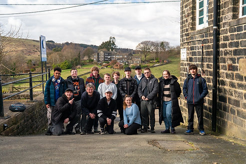


7th, 10th & 14th of March 2025
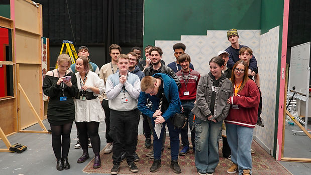
Below contains the final production day on the set of Beware Out There! & the process of the set build that I leaded.
Read below to find out more!

Choosing Wallpaper
Here I am in B&Q deciding on which wallpaper to purchase for our set build. In order I make the right decision, I contacted the Director for his opinion and also referred to my research.

Separating Flats
In this image, myself and a peer who was helping out in our art department were taking the flats apart from a previous set in the studio. We would then use these three flats for our own set build.
Putting the Flats Together
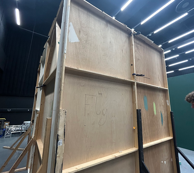
This image shows the flats once they had been put together. We had a three-flat set. Our collaboration within the art department helped to get this done efficiently.

Putting the Flats Together
This image shows the flats once they had been put together. We had a three-flat set. Our collaboration within the art department helped to get this done efficiently. It was now time to wallpaper and dress the set.

Printing Out Props
I wanted to add some personal touches to the set, personal to the characters in our film, so the audience could infer that the room they were looking at was that of James' home. I printed out a Polaroid-style photo (Authentic to the 70's) that I had edited myself. The background of both images are not actually real, they are AI generated to put the character in a different environment. With some clever editing including shadows, the pictures seem genuine. I checked with my peers to see whether they noticed or not and the effect was surprisingly good.

Deciding on Furniture
Here I am deciding on furniture for our set build with the help of my art director. The furniture needed to be authentic to the time period, and I also wanted a lot of browns to contrast with the wallpaper. In the end, I opted for a similar chair but with a lighter shade of brown wood.
Deciding on Furniture
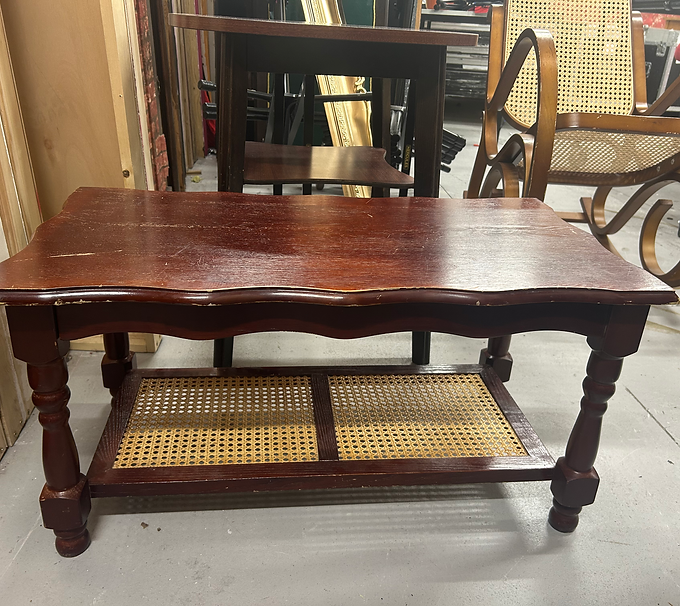
Here I am deciding on furniture for our set build with the help of my art director. The furniture needed to be authentic to the time period, and I also wanted a lot of browns to contrast with the wallpaper. In the end, I opted for a smaller side table that was a lighter colour to match the chair.
Set Decorating
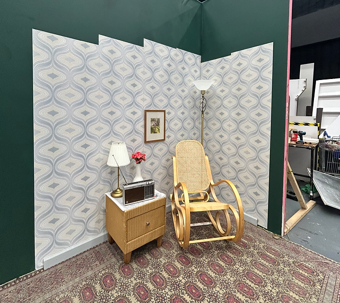
Now that I had decided on props and furniture, it was time to place them on our set. This is the final aesthetic of our set build. It matches up with my research of 70's living rooms, with the amount of geometrical patterns, brown and dull colours, and authentic prop pieces such as the 1973 Phillips Radio.

Close Up on Props
Here you can see the props on the side table that we placed.

Close Up on Set
Here is a close-up on the details of the set, such as the wallpaper, lamp and photo frame.

Adjusting Furniture
In this image, I am pictured making slight adjustments to the furniture. This was due to the chair I chose being a rocking chair, which would be a pain for continuity and our actor. To solve this problem, I used a scrap piece of wood and secured it along the bottom of the chair so it could no longer rock backwards.

Adjusting Furniture
In this image, I am pictured making slight adjustments to the furniture with my Art Director. This was due to the chair I chose being a rocking chair, which would be a pain for continuity and our actor. To solve this problem, I used a scrap piece of wood and secured it along the bottom of the chair so it could no longer rock backwards.

Final Look of Set Build
Here you can see how the final set build looks. I was very pleased with the overall aesthetic of this 'room', as were other crew working on the production. The sandbag would not be seen on camera and was used to reinforce the adjustments made to the chair, ensuring the actor's safety.

Actor Engaging in the Set
Here, our wonderful actor is going for a rehearsal. You can see how well the costume complements the environment around it. Overall, I think I captured the time period really well, and it is easily identifiable as the 1970s.
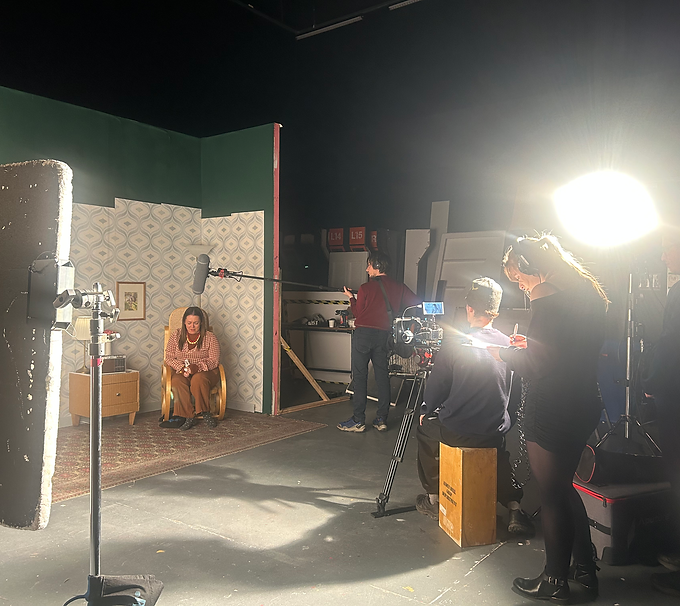
Going For a Take
This image shows our crew and actor going for a take on the set we had just finished dressing. You can see behind the scenes of what it was like on our final day of shooting Beware Out There!

Recording Voiceover
After I had finished my responsibilities as production designer, the director asked if I would record a voiceover to possibly be used in the edit of the film, acting as the radio announcer. This was the first time I had ever done any voice recording for a film, it was a fun experience.
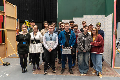
A Wrap On
Beware Out There!
And that was a wrap of the complete production of BOT! A very successful and productive shoot. It was now time to move onto post-production.
I have gained such valuable experience from this shoot; this has been one of my favourite shoots I have been involved with to date. This is the first shoot that I have been a HOD and production designer, so I have learned a lot of new skills and gained experience. Everyone I have worked with has been a pleasure to work alongside, and I have thoroughly enjoyed making props, designing and building the set. This full week of production has truly made me realise that I want to carry on with my dream of working in the industry!
Production Diary
This is my production diary, where I have kept a log of the weeks leading up to filming and also commented on the days of production. This was a great way of seeing my progress and development throughout semester 2.
Onset Observation Form
This form was filled out by me with National Occupational Standards and how I think they rate on the traffic light system. It was then filled out by my tutor who was observing me onset.

Traffic Light NOS Table
This table shows the National Occupational Standards I selected to focus on when it comes to production design. I then had to analyse my performance to grade them, which also included a grade from my tutor and a peer.

Production & Costume Designer's
Commentary
This is a commentary video that I have filmed where I watch through the current version of the final product of Beware Out There! and deep dive into decisions I made about props, costumes and sets. I will give an insight into behind the scenes of production, and share my feelings about what we have produced as a crew on a very small budget film. Click below to play.
BEWARE OUT THERE!
Below you will find the current version of Beware Out There! The short film that we have spent months making and are all so proud of. This is the current and up-to-date draft, but will have some final finishing touches added to it before it is screened to the public. Click below to view. Enjoy!
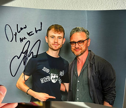

This section below contains any additional work outside of University. This contains work such as my time being a support actor on a major TV production, my showreel, networking events and more.
Being A Supporting Actor
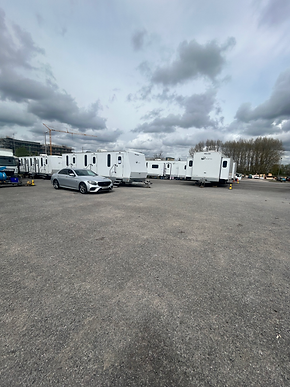
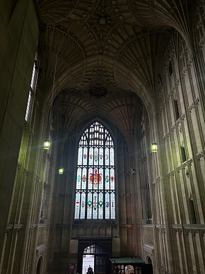
I recently received a job to be a supporting actor on an upcoming TV series for BBC One. I was acting as an Oxford University Student set in 2005, filming in Bristol. This was a great experience as I made some great contacts and got to work alongside experienced industry professionals. I cannot say too much about this production, but it was a very insightful experience that I can benefit from. Here are some BTS.
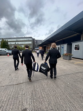



Networking Event
I recently attended a networking/careers event at the AO arena. This was a good experience to broaden my connections, network and view possible industry career opportunities.


Updated Showreel
Below you will find my updated showreel that I recently edited together. It is always useful to have an up-to-date showreel to show to potential clients and employers. Click below to play.
To Conclude...
That brings a wrap to my final year at Manchester Film School. I have grown so much as a person and as a professional working in the industry. I have had the most amazing time working with amazing people. I have grown in confidence massively, I never thought that I would be leading a team in a major project when I first walked through the doors at MFS or seeing my name on a cinema screen. I have learnt so many vital industry skills and broadened my knowledge of the film and television industry massively whilst working here. I feel very prepared to take on new challenges and make my way as a professional working in the industry.
As one of my biggest influences and inspirations, Sofia Coppola says: 'You can certainly explore options in various ways, but the ideas that you're passionate about will surface on their own. Just watch a lot of movies, read a lot of books, and experience life. The stories will come out of nowhere — that's the magic.' (Screencraft.org, 2019). This is something I have been referring to when working at the film school. I try to watch as many films and read as many books as possible so that I gain inspiration but also naturally through experiencing the world with my own eyes.
Heres to many more years being involved in the industry, and most importantly, making films!